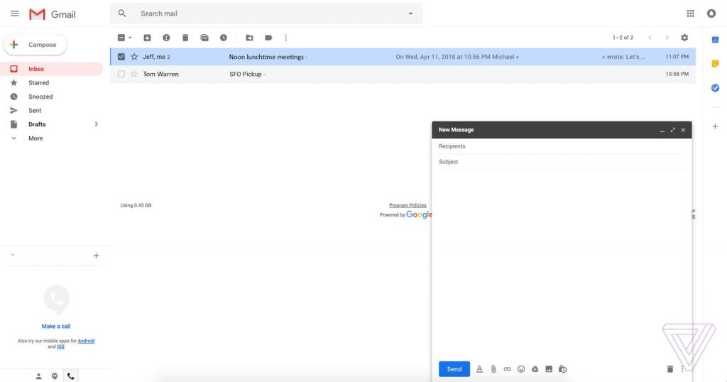
The new design falls in line with Google’s overall design. Corners are rounded, there’s a hamburger menu in the top left next to a fresh Gmail logo, and the red “Compose” button has been replaced with a white, circular one with a colorful “+” icon.
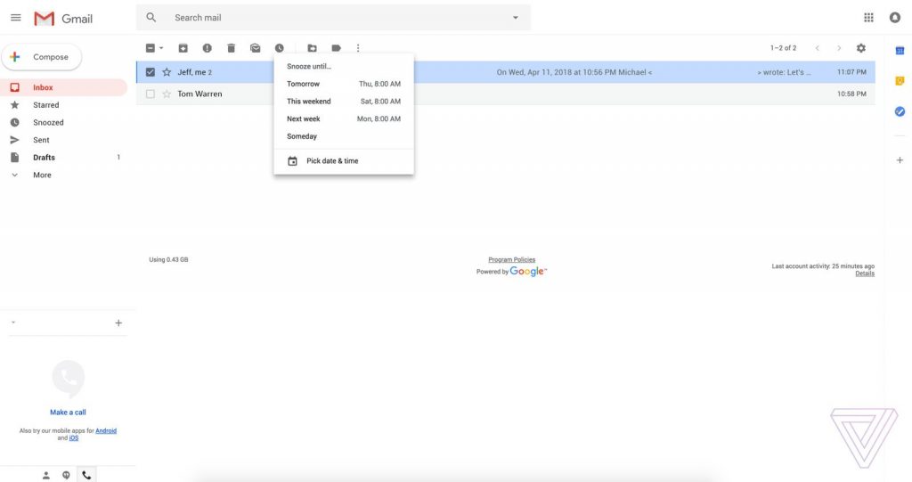
The new design also sports a feature we have seen in Google’s other mail app for Gmail, Inbox since 2014. Snooze, as the feature is called, allows users to remove a mail from the inbox for a given amount of time. This is especially useful when say you want to deal with only work stuff, you can snooze those personal emails until after working hours.
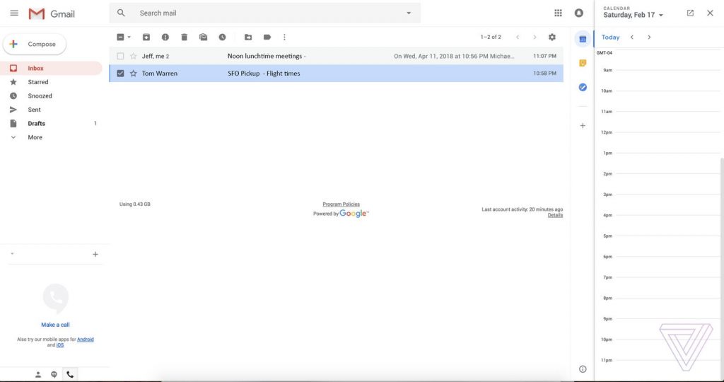
On the far right, there is a sidebar with shortcuts to other Google apps. This allows you to quickly open Google Calendar, Keep, and Tasks without having to leave Gmail. There might also be an option to customize these shortcuts so you can add exactly what you need and what is useful to you to make the Gmail truly yours.
The new design is set to roll out to all Gmail users in “the next few weeks”. With Google I/O 2018 right around the corner, maybe that is where we will get more details about this new design, its complete feature-set and hopefully, redesigns to other Google Services.
